Page 1 of 2

Responsive desktop design

PostPosted: Tue Jan 27, 2015 7:07 am
by Otto
Hello,
Is there a way that we can achieve “Responsive desktop design” similar to RWD.
Best regards,
Otto

http://en.wikipedia.org/wiki/Responsive_web_design
From Wikipedia, the free encyclopedia
Jump to: navigation, search
Responsive web design (RWD) is an approach to web design aimed at crafting sites to provide an optimal viewing experience—easy reading and navigation with a minimum of resizing, panning, and scrolling—across a wide range of devices (from desktop computer monitors to mobile phones).[1][2][3]
A site designed with RWD[1][4] adapts the layout to the viewing environment by using fluid, proportion-based grids,[5][6] flexible images,[7][8][9] and CSS3 media queries,[3][10][11] an extension of the @media rule, in the following ways:[12]
Re: Responsive desktop design

PostPosted: Tue Jan 27, 2015 4:21 pm
by James Bott
I'm sure there is a way, however, it will take a lot of work.

Instead of fixed screen layouts, the placement of all windows, dialogs, and controls has to be calculated based on the screen size. Hmm, you would probably also have to change the font size. Then there is the issue of touch screens. Items need to be large enough to manipulate via touch.

Lots of work, but maybe something worth looking into.

Re: Responsive desktop design

PostPosted: Tue Jan 27, 2015 5:59 pm
by Otto
Hello James,
Thank you.
>Lots of work, but maybe something worth looking into.

Yes a lot of work but a must have.
More and more users operate the software with mobile devices.

Best regards,
Otto

Re: Responsive desktop design

PostPosted: Tue Jan 27, 2015 10:57 pm
by James Bott
Otto,

It is even more work with data intensive applications than with RWD. Because RWD is mostly referring to website design not data entry design. Moving a few panels and graphics around and resizing them takes a lot less effort than moving and resizing data entry controls. Of course, this is being done with some apps that run on both phones and tablets, but I have not heard of any that also run on desktops. And most apps I have seen that run on phones and tablets are not nearly as complex as most of our data apps.

Then there is the issue of "Modern" design for Windows 8. They really have to be written differently due to the design requirement issues. If you watched the Windows 10 announcement a few days ago, you know that they were talking about the same apps running on phones, tablets, and desktops, but very few people have windows phones so that is a chicken and egg thing. Without apps, they can't sell the phones and without phones nobody will buy the apps.

Re: Responsive desktop design

PostPosted: Wed Oct 24, 2018 9:22 pm
by Otto
Hello,
at the moment I am working on responsive dialog design.
Best regards,
Otto

Image

Re: Responsive desktop design

PostPosted: Thu Oct 25, 2018 4:07 am
by Bayron
I believe there is a class named tLayout, that can be used as you describe, I remember I used it once on a test, but it didn't do everything I wanted...

My solution was to hardcode everything... No more RESOURCES

It does takes a lot of work and it takes a lot of control while programming, especially because all of the coordinates will be in variables...

If you want to resize your window or dialog, you may have to use a subclass to control your refresh rate....

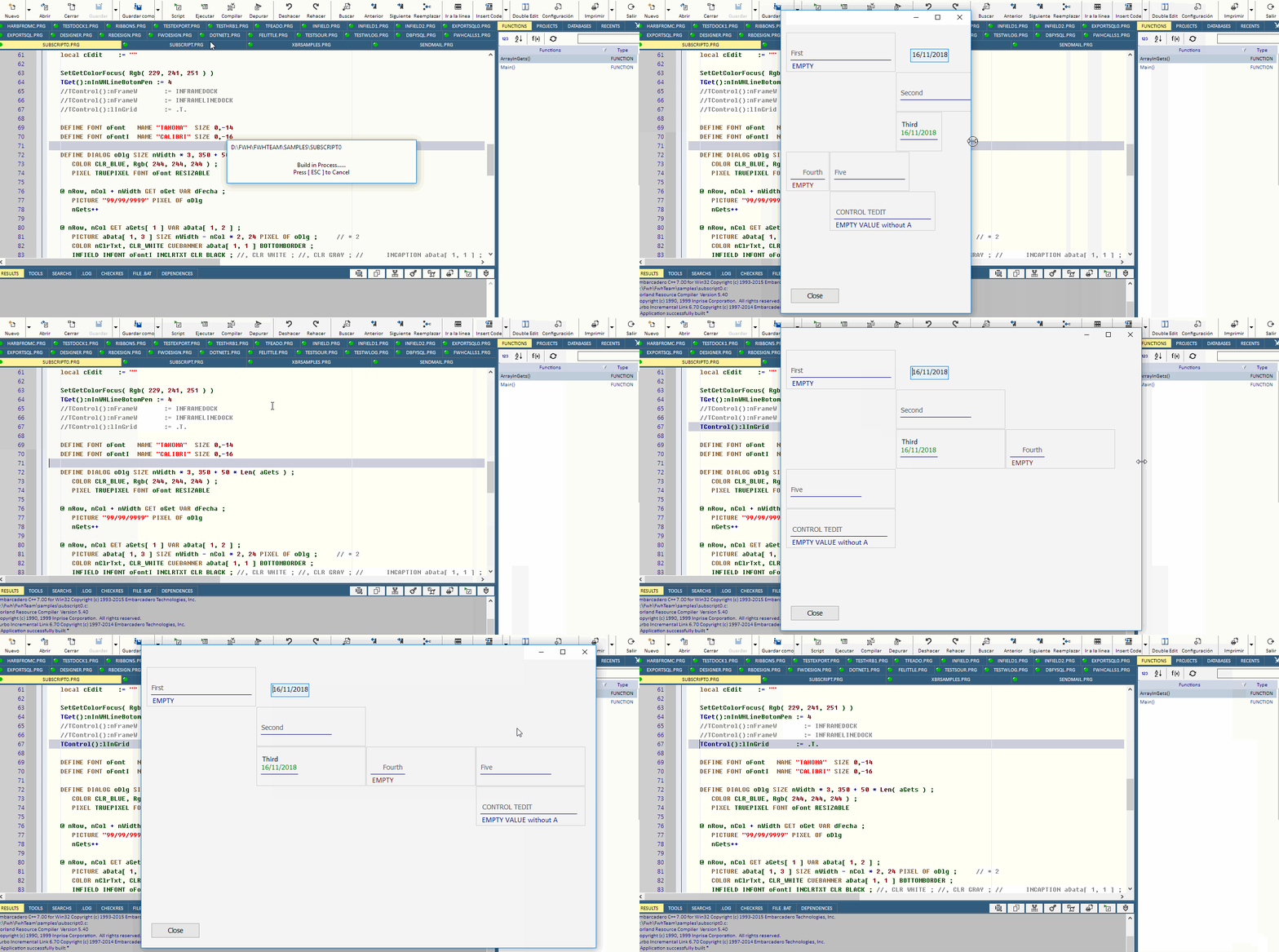
To create the dialog that adjust to the device screen resolution, in my case, full screen:

Code: Select all  Expand view
DEFINE dialog oDialog ;
        size WndWidth( GetDesktopWindow() ) , WndHeight( GetDesktopWindow() );
        PIXEL ;  
        BRUSH oBrush;
        STYLE WS_POPUP      


Divide your screen in areas

Code: Select all  Expand view
//Coordinates of areas of the screen
aAdd( Cuadro1 , { 14 , 14 , ( INT( ( oDialog:nHeight / 2 ) * .46 ) - 2 ) , ( INT( ( oDialog:nWidth / 2 ) * .40 ) ) } )
aAdd( Cuadro2 , { 14 , ( INT( ( oDialog:nWidth / 2 ) * .40 ) + 4 ) , ( INT( ( oDialog:nHeight / 2 ) * .57 ) - 2 ) , ( INT( ( oDialog:nWidth / 2 ) )- 10) } )
aAdd( Cuadro3 , { ( INT( ( oDialog:nHeight / 2 ) * .46 ) + 4 ) , 14 , ( INT( ( oDialog:nHeight / 2 ) ) - ( INT( ( oDialog:nHeight / 2 ) * .46 ) ) ) , ( INT( ( oDialog:nWidth / 2 ) * .40 )  ) } )
aAdd( Cuadro4 , { ( INT( ( oDialog:nHeight * .57 ) / 2 ) + 4 ) , ( INT( ( oDialog:nWidth * .40 ) / 2 ) + 4 ) , ( INT( ( oDialog:nHeight / 2 ) - 5 ) ) , ( INT( ( oDialog:nWidth / 2 ) * .60 ) ) } )
aAdd( Cuadro5 , { ( INT( ( oDialog:nHeight / 2 ) * .57 ) + 4 ) , ( INT( ( oDialog:nWidth / 2 ) * .60) + 4 ) , ( INT( ( oDialog:nHeight / 2 ) - 10 ) ) , ( INT( ( oDialog:nWidth / 2 ) ) - 10 ) } )


Manage the size of your buttons or controls

Code: Select all  Expand view
Btn1Height := ( ( Cuadro1[1][3] ) - ( Cuadro1[1][1] ) - 12 ) / 4
Btn1Width  := ( ( Cuadro1[1][4] ) - ( Cuadro1[1][2] ) - 12 ) / 4
       
@ ( Cuadro1[1][1] + ( Btn1Height * 1 ) + 9 ) , ( Cuadro1[1][2] + ( Btn1Width * 0 ) +  8 ) BTNBMP oBtnF[ 1] OF oDialog SIZE ( Btn1Width - 4 ) , ( Btn1Height - 4 ) CENTER PIXEL ADJUST NOBORDER FONT oFont1 PROMPT "BOTON1"
@ ( Cuadro1[1][1] + ( Btn1Height * 1 ) + 9 ) , ( Cuadro1[1][2] + ( Btn1Width * 1 ) +  8 ) BTNBMP oBtnF[ 2] OF oDialog SIZE ( Btn1Width - 4 ) , ( Btn1Height - 4 ) CENTER PIXEL ADJUST NOBORDER FONT oFont1 PROMPT "BOTON2"
@ ( Cuadro1[1][1] + ( Btn1Height * 1 ) + 9 ) , ( Cuadro1[1][2] + ( Btn1Width * 2 ) +  8 ) BTNBMP oBtnF[ 3] OF oDialog SIZE ( Btn1Width - 4 ) , ( Btn1Height - 4 ) CENTER PIXEL ADJUST NOBORDER FONT oFont1 PROMPT "BOTON3"
@ ( Cuadro1[1][1] + ( Btn1Height * 1 ) + 9 ) , ( Cuadro1[1][2] + ( Btn1Width * 3 ) +  8 ) BTNBMP oBtnF[ 4] OF oDialog SIZE ( Btn1Width - 4 ) , ( Btn1Height - 4 ) CENTER PIXEL ADJUST NOBORDER FONT oFont1 PROMPT "BOTON4"
@ ( Cuadro1[1][1] + ( Btn1Height * 2 ) + 9 ) , ( Cuadro1[1][2] + ( Btn1Width * 0 ) +  8 ) BTNBMP oBtnF[ 5] OF oDialog SIZE ( Btn1Width - 4 ) , ( Btn1Height - 4 ) CENTER PIXEL ADJUST NOBORDER FONT oFont1 PROMPT "BOTON5"


To control the size of the font depending on the device resolution:

Code: Select all  Expand view
DEFINE FONT oFont1 NAME 'Arial' SIZE 0 , If( oDialog:nHeight <= 900 , If( oDialog:nHeight <= 600 ,  6 , 14 ) , 20 ) BOLD


This way, I manage every control to adjust to the resolution of the device, including fonts....

Image
https://www.facebook.com/photo.php?fbid=2079322301953&set=pb.1211881135.-2207520000.1540439740.&type=3&theater

Re: Responsive desktop design

PostPosted: Thu Oct 25, 2018 4:25 am
by Bayron
By this approach, I can also control the size of my dialog, in this case, using a configuration file..

https://www.youtube.com/watch?v=PVQpK-Eu7qo

or on the fly

https://www.youtube.com/watch?v=W6ZiCdad-nY

Re: Responsive desktop design

PostPosted: Thu Oct 25, 2018 10:25 am
by Silvio.Falconi
Otto,
You could use the same technique that Rao explained to make the dialogs in a tablet

http://forums.fivetechsupport.com/viewtopic.php?f=3&t=34457&hilit=tablet+dialog#p204793

Re: Responsive desktop design

PostPosted: Thu Oct 25, 2018 11:29 am
by Otto
Hello Silvio, hello Bayron,
thank you.
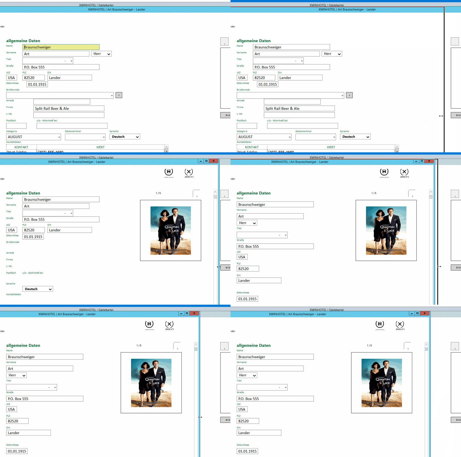
So far I have responsive now working.
Please see the pictures.
If the screen has a certain width then there are 2 columns with get fields.
When the width is smaller the screen changes to one row one get field.
But as Byron wrote there is a lot of coding work.

Best regards,
Otto
Image

Re: Responsive desktop design

PostPosted: Thu Oct 25, 2018 12:13 pm
by hmpaquito
Hello Otto

Responsive design is a very interesting topic.

From the other side of the galaxy someone using a system grid that allows the controls to be placed in each cell.
http://prd.one-two.com:51042/demo/Grids ... ayout.html

This system is the same as the Material design.

The incorporation of this system to Fwh or to TWeb would be very beneficial for the whole community because it would avoid the rigidity of the current screens.

Having at the base of the system (fwh, TWeb, etc) a grid system would make the responsive development very easy. The opposite is a great pain.

My two eurocents.

Re: Responsive desktop design

PostPosted: Thu Oct 25, 2018 1:55 pm
by Carles
Paquito,

I agree with you on the interesting topic

Many people would like a single code for several environments and if you can, also a same screen for all the "devices" that exist. Buff, how could this be achieved?

It really is an exciting topic, but I think we must first separate for example desktop screens and smartphones screens.

And then in each type of environment, the way that you can design your dialogues and that your controls have a certain flexibility. The word "responsive" scares me, because when you resize a screen if you do not do it right, all the controls are stacked. Really good management of redistributing controls is difficult.

With fwh you can create screens that your controls are readapted but here you hear with many opinions. Design of a window with static controls, semi-adaptive controls or very adaptive controls. Which is the limit ? How to control the visual flow of these controls?

If we think that our applications are business management, we generate screens with numerous controls. Designing these screens with the same "live" controls can sometimes be a very difficult task. It is not the same to readjust, for example, a browse inside a screen together for example to a pair of gets, that on the otherway have 50 controls and that these follow a logical flow of readaptation.

two cents more..

Re: Responsive desktop design

PostPosted: Thu Oct 25, 2018 2:50 pm
by hmpaquito
Carles,

Carles wrote:Many people would like a single code for several environments and if you can, also a same screen for all the "devices" that exist. Buff, how could this be achieved?

http://prd.one-two.com:51042/demo/Grids ... ayout.html


It really is an exciting topic, but I think we must first separate for example desktop screens and smartphones screens.

Nope. No separate devices. Mr. Otto's user run his desktop application in mobile device. ¿ Is neccessary two screen design ? No: One screen design.

With fwh you can create screens that your controls are readapted but here you hear with many opinions. Design of a window with static controls, semi-adaptive controls or very adaptive controls. Which is the limit ? How to control the visual flow of these controls?

Same app on different devices. The key is system grid.
https://www.youtube.com/watch?v=TcTdFcligCM

Regards

Re: Responsive desktop design

PostPosted: Thu Oct 25, 2018 4:05 pm
by Carles
Paquito,

hmpaquito wrote:Nope. No separate devices. Mr. Otto's user run his desktop application in mobile device. ¿ Is neccessary two screen design ? No: One screen design.


You can run your desktop application on a mobile device, and it works! This is true, but ... it is not the same.

When you design a desktop application you have a lot of data that does not make sense to show on another device, such as a smartphone. A smartphone must have the right data. It is for this reason that I think that a screen that can be used for everything does not make sense. You can do it ? Of course.

So if I think you can design a dialogue that adapt the different sizes of desktop screens. Here if I think it can be debated, but all in one ...

Instead, I think we can discuss a system of adaptation in desktop applications, using for example layers.

But all this is just my impression on the topic, of course... :D

Re: Responsive desktop design

PostPosted: Fri Nov 16, 2018 2:47 pm
by cnavarro
Llevo tiempo investigando e intentando dar una posible solución a este tema, pero sin que el usuario tenga que cambiar su código ( con variables en sus coordenadas u otras posibles soluciones ), o por lo menos intentando que el cambio que realicemos en nuestro código sea el menor posible.

I have been researching and trying to give a possible solution to this issue, but without the user having to change their code (with variables in their coordinates or other possible solutions), or at least trying that the change we make in our code is the minor possible.

Según mi punto de vista hay que diferenciar entre:
A) La distribución y colocación de los controles adaptándose al tamaño de la pantalla
B) Su correcta visualización por la resolución del dispositivo que estemos utilizando

According to my point of view it is necessary to differentiate between:
A) The distribution and placement of the controls adapting to the size of the screen
B) Its correct visualization by the resolution of the device that we are using

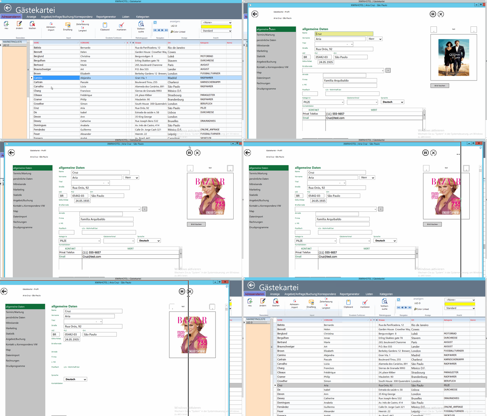
Para la primera A), tengo hecho un desarrollo, muestro una simulación haciendo un resize del contenedor, en el que los controles se han de situar automáticamente siguiendo en la medida de lo posible el patrón en el que había sido diseñada la pantalla.

For the first A), I have done a development that I hope to finish shortly and I show a simulation by resizing the container, , in which the controls must be placed automatically following as far as possible the pattern in which the screen was designed.

Image

Para la segunda B) hay varias opciones, ya que no tengo claro que sea sólo un problema de proporcionalidad, que es la que he utilizado hasta ahora, ya que incluso, se puede dar el caso que sea inversamente proporcional para que su visualización en dispositivos con mayor resolución sea correcta, sobre todo al probar nuestras aplicaciones en monitores modernos 4K, etc. con una resolución muy superior a la que estábamos acostumbrados. Espero sus comentarios en este apasionante tema

For the second B) there are several options, since I am not clear that it is only a problem of proportionality, which is what I have used so far, since even, it may be the case that is inversely proportional to its display on devices with higher resolution is correct, especially when testing our applications on modern 4K monitors, etc. with a resolution much higher than what we were used to. I await your comments on this exciting topic

Re: Responsive desktop design

PostPosted: Fri Nov 16, 2018 4:00 pm
by Silvio.Falconi
Cristobal,
I need it for a Panel Scroll class
I want that when you resize the scroll panel must also put in place the controls that are inside: to be exact I use only btnbmps controls inside the panel